Tips for creating wireframes in Sketch

Sketch, by Bohemian Coding, took the design world by storm and it affected Adobe so much that they've rushed to create a competitor product (Experience Design). I have started using Sketch at version 2 when it wasn't as usable as it is nowadays. However, in my opinion, it is by far the best tool for both UI and UX at the present moment.
There are quite a lot of resources and articles on how to use Sketch to create great UI's, not so many on how to use Sketch for UX design. I use it in all stages of my UX process - from simple page flows and feature maps to wireframes and prototypes.
Recently, I've worked on a complex UX project where I ended up creating over 100+ wireframes. It was my first time working on such a huge project but Sketch delivered good performance (not great, but hey, imagine Adobe Photoshop dealing with 80 wireframes in a single document) and the perfect set of features to deal with this.

Page with 43 wireframes - zoomed out
The goal for this project was to explore a new UX path for creating a specialized survey - the web app already does this but the client wanted to offer a better way to do this to their customers. I presented the progress on a weekly basis and I've used Invision to do that.
The reason I mention Invision is because this will make the first tip.
1. Use a prototyping and collaboration app to present it to the client
I've used Invision for this project but Marvel is as capable as Invision. The reason I choose to use these types of apps is that you can link the pages together and create a prototype from my wireframes. This saves a lot of time needed to explain simple things but it also a simple way for clients to give feedback directly on the wireframes. That in itself is a huge timesaver.
Another reason for introducing prototyping this early in the process is that at this step, it's the best time to deal with changes. I think of wireframes as drawings on a piece of paper that eventually get thrown in the trash bin giving way to the UI.
2. Organize your document logically
This is not necessarily a Sketch tip, but since I use Sketch it applies to it. I organize my wireframes logically. I make use of Sketch pages a lot and I use them to split the wireframes in logical sections and workflows.
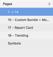
Usually, the first screen is some sort of "start screen" and that usually is my first page. In my case, it was a "dashboard" and it contained most of the dashboard elements. I then continue with pages for each major section / flow in the site. In my particular case, it was a user type that had to complete a number of tasks. I used a separate page for each major tasks, and for smaller tasks, I've grouped them together and used a single page for this purpose.
3. Number your artboards
Since the goal for the wireframes is to have them presented to the user and our medium is Invision or Marvel, I chose a combination of letters & numbers the artboards rather than just name them. The reason for this is that it makes a lot easier to export the wireframes and use them in Invision. By numbering the wireframes the flow in Invision will match my screens exactly - it will make updating the wireframes a lot easier.
How I do it. Since I already break the document in pages, and name them, I use this system to number the artboards:
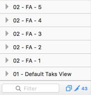
[number]-[Flow]-[position]. Here's how it looks in real life:
1-Dashboard-1 - that means this arboard will be the first item that will be seen in the wireframes series. If I want to add additional elements to the Dashboard I use 1-Dashboard-2 and so on.
4. Use symbols
Bohemian Coding, the makers of Sketch introduced some powerful updates to symbols making them ideal for wireframing.
Here are the symbol features that will make a huge difference in your wireframing workflow:
Symbol resizing - This alone is a game changer - it's not just resizing per say, it is smart resizing. I can use the symbol settings to smartly position elements inside the symbols so I an reuse them at different sizes without the need to create variations.
Text overrides - Again, this feature is very helpful when prototyping - you can reuse symbols and create instances of that symbols that will have different text.
Here's an example on how I use symbols for form inputs.

The symbol above is a basic symbol for a dropdown - If I double click on it I get this view:
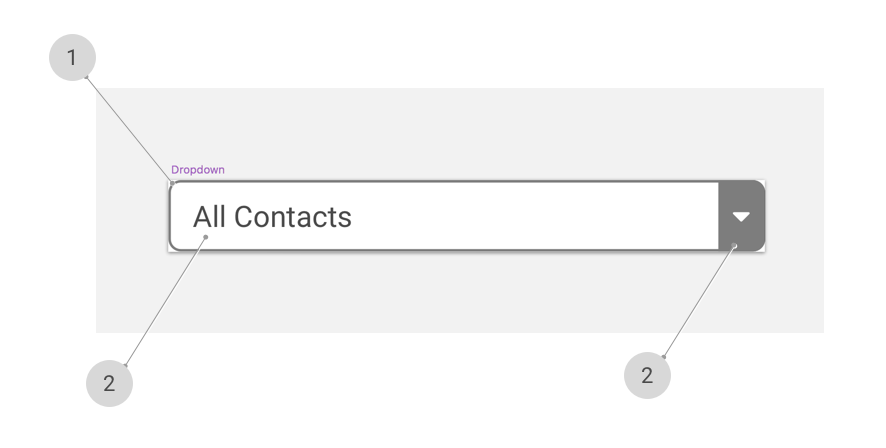
#1 - The rounded rectangle that gives the outer border of the dropdown
#2 - The text in the dropdown
#3 - The dropdown down arrow
By default, all these elements have their resize setting to "stretch". Here's what happens when I try to resize the dropdown with the default settings for each element:

As you can see from the image above, whether I try to enlarge or contract the dropdown the elements get distorted and they change their place. This is not really what we have in mind when resizing.
Now let's tweak the settings of the dropdown and see what happens.
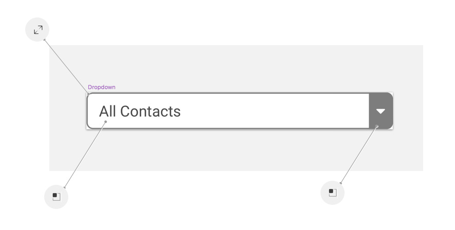
Here are the settings I used:
#1 - the rounded rectangle is set now to resize if the symbol is resized. This is similar to stretch but in our case it's the best choice.
#2, #3 - Both the text and the dropdown arrow are set to "Pin to corner" - this settings detects what corner is the closest to the element and it will keep the element aligned to that corner without changing the element's size.
Here's what we get once we're done with the change:

As you can see in the image above, you can now safely resize the dropdown - it will work great in almost any size and with just one symbol, we have now a lot of possibilities and flexibility.
5. Use Craft by Invision
Craft is a Sketch plugin developed by Invision and it comes with a few very handy features that will speed up your flow weather you are creating wireframes or designs.
For wireframing, there are two main features in the plugin that I use a lot:
1) Library and
2) Duplicate
The Library feature lets you use a document or a shared library and reuse symbols from it. I use a shared wireframes library that has my most used elements (forms, browser mock, etc). The neat thing about it is that it can be stored on Dropbox for example, and the whole team can contribute to it.
The Duplicate feature, let's you duplicate an element - be it a symbol, group or shape based on a few simple settings - vertical / horizontal / or both - count and gutter. That again, is a time saver.
6. Conclusion
We live in good times for UX / UI designers - no more switching from tool to tool to do our jobs. I think it's so nice to be able to use a single tool, improve on your skills and be more efficient at the same time. I love Sketch and I hope the team at Bohemian Coding will keep delivering great updates. Happy Sketching!


